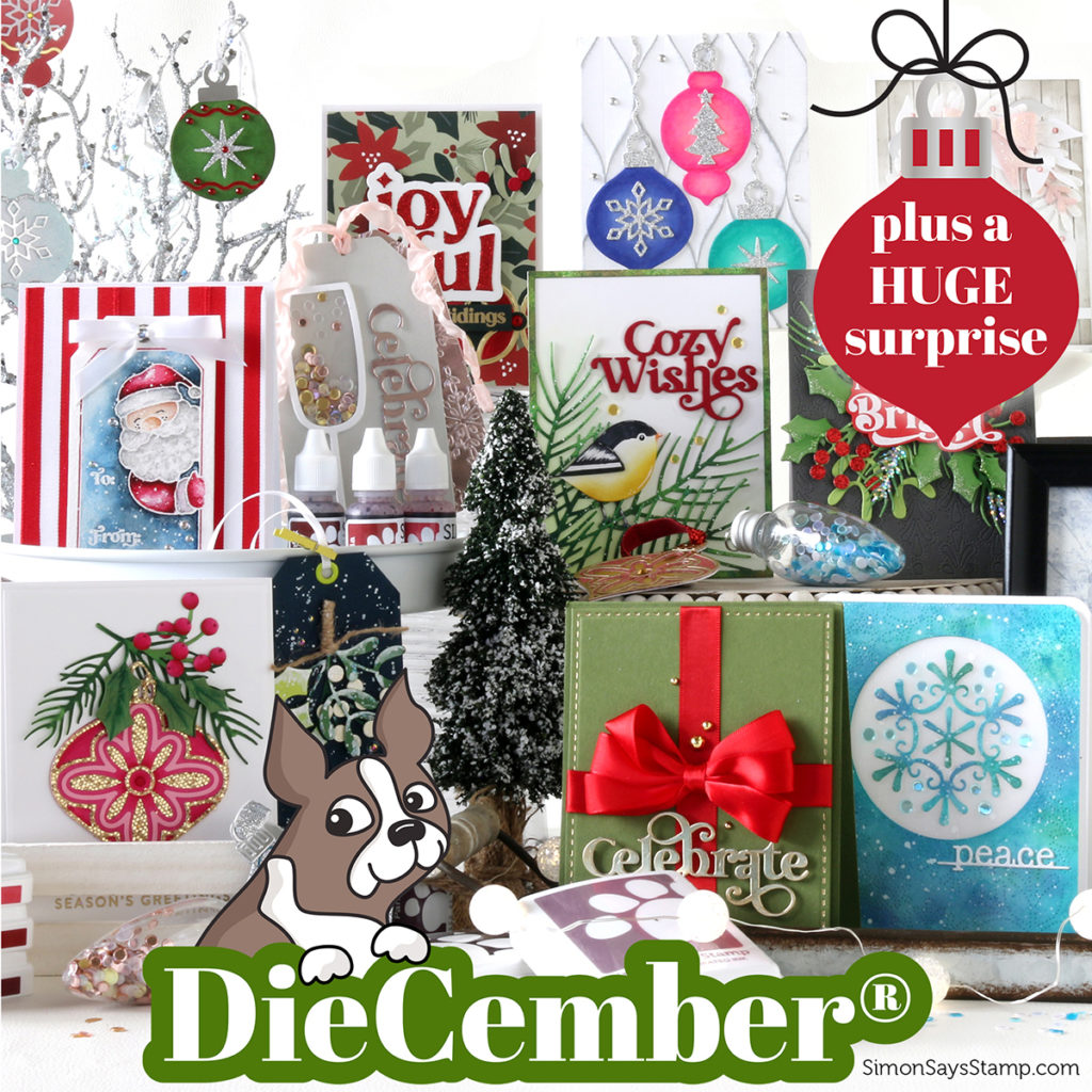
Hello, friends! It’s December 1st, and that means it’s DieCember® at Simon Says Stamp! There is an amazing new release, and while it may sound like it’s all about dies, there are many other goodies, as well. I will be sharing several of those with you today. One of the stars of the release, which is now on my wish list, is the new set of Pawsitively Saturated ink colors Gradient 6. They are beautiful, muted shades of red and purple. I know that I usually try to have a video up for releases, but I’ve been battling a migraine this week. Hopefully, I will be able to get back into creating more soon. In the meantime, I have pictures of all my cards and brief descriptions below.
NOTE: All Supplies are linked to multiple sources in the thumbnails at the end of this blog post.
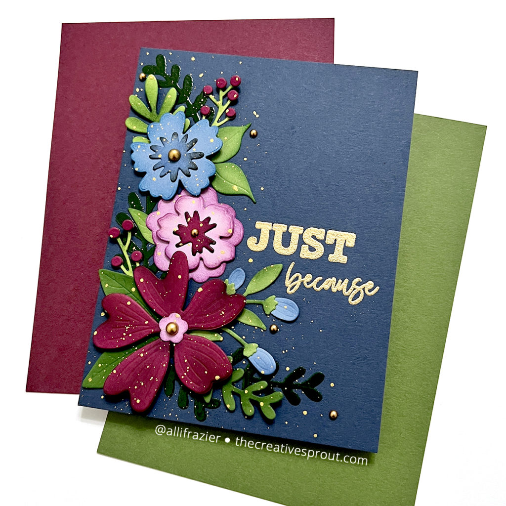
I know that I said this release wasn’t all about dies, but I am going to start off with a die set. And, it’s a big one! The Aurora Blooms set is a floral die set with 31 dies! Wow! There are leaves, flowers, and all the little details in between. I chose this dramatic color palette for my card. I added shading to my die cuts with some ink, but that’s not all I did. I also used a couple of the leaves to create stencils. I added embossing ink through the stencil and then heat embossed with Distress Embossing Glaze! I first used Prize Ribbon glaze, but then I ended up added Twisted Citron on top. This adds another element of texture to the card. I added a sentiment using the Cozy Autumn Hugs stamp set and gold embossing powder and finished up with some gold splatters and embellishments.
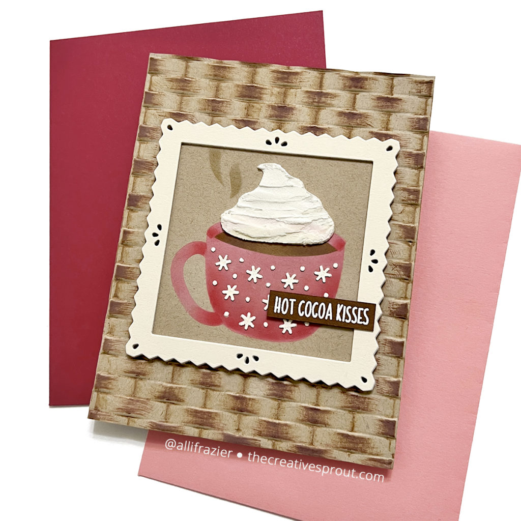
For my second card, I stenciled the mug from the Cozy Cocoa Stencils set. And while it is so sweet, I think the star of this card is the new Woven Embossing Folder. I used some Vintage Photo Distress Oxide to bring out all the details of this panel. The square frame is from the Waffle Flower Pinking Squares die set.

My third card uses just one product, and that is the aptly named Joyful Greetings Stamp set. I don’t often do one layer cards, and it’s been awhile since I made a card without any die cuts on it! Of course, I used the left side of my brain to line up this pattern, and I love how it turned out. The main stamp in this set matches the Joyful Greetings Die, which was released last month. This allows for a lot of fun combinations, which I’ll be playing with soon.
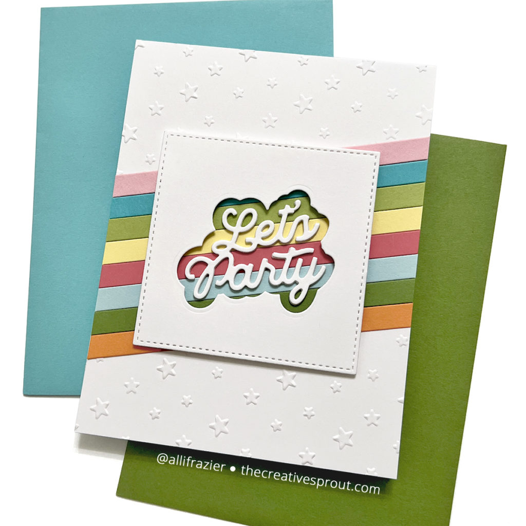
My last card features another die – the Let’s Party die. This die comes with a shadow layer. I first cut a white square with the MFT Stitched Square Stax Die-namics, and then I used the shadow layer to create a window. I added colored paper strips underneath to make the word die pop. I made these strips with the Pinkfresh Studio Color Block Stripes die. Before adhering everything down to my card base, I embossed my main panel with the Twinkling Stars Embossing Folder.
I hope these cards put a smile on your face! I had a lot of fun making these. Be sure to check out all of the other products that are in the DieCember® release. Thanks for visiting my blog today.
Wishing you all a crafty day,
Allison
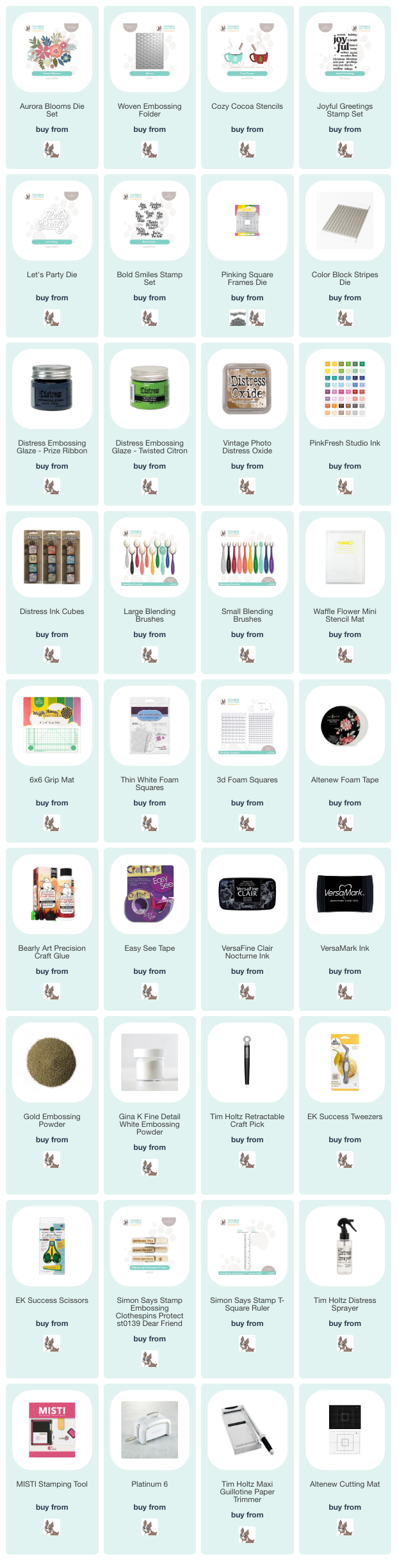
SUPPLY LIST
Note: External links on my blog may contain affiliate links. This gives me the opportunity to earn a small commission when you click on the links and place an order. This comes at no additional cost to you. Thank you so much for your support! You can see more information on my Affiliate Disclosure page.
These are gorgeous!! Please share with me, who makes those beautiful colors of card stock in your 1st picture? The deep, dark red or burgundy, the blue and that green? I was hoping to find it in your supply list but unfortunately it’s not listed. Thank you
Thank you so much! Yes, I rarely list my card stock in my supplies. But, most of my card stock is from My Favorite Things and Taylored Expressions. I believe the burgundy and green colors in that picture were envelopes, as that is how I normally take photos. As for the burgundy, I have a very similar color from Hero Arts called Hero Hues Plum. That may have slightly more purple than the one in my photo, but it’s a really beautiful color. For the green, closest would be Taylored Expressions Peapod or Cilantro, which is slightly darker. And the blue that I used was most likely Blueberry from MFT, which is now retired. I have a LOT of MFT paper in colors that were discontinued a few years ago. Denim Blue from Spellbinders is probably close to it. Hope that helps!