Hello, crafty friends. I hope you are all doing well. I am still sitting here dreaming of spring, even though we have yet another fresh layer of snow here! So, although I am in the mood for making spring cards, I still sometimes need to find inspiration to actually sit down and create something. I can often find my crafty mojo by looking for color challenges or some other type of color inspiration.
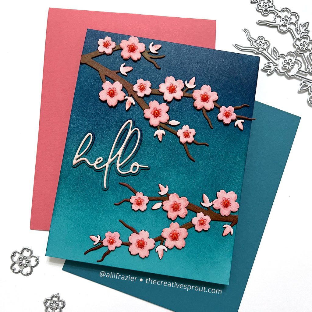
Another great way to find inspiration is to look at some of the cards you’ve made in the past that you still really love. I made a very similar card a couple years ago using these Cherry Blossom dies from Hero Arts, so I decided to recreate it with today’s color scheme. And speaking of today’s color scheme, I randomly pulled out a card from my Color Cubes, and this is the one I got:
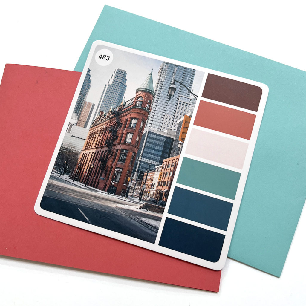
Do you need to have Color Cubes to do this? Of course not! You can just google “color palette” to get all sorts of ideas. I personally like pulling a card out at random and challenging myself to use a new color scheme. And also…I was in the mood to spoil myself when I ordered these cubes! This color scheme may not scream “spring” at you, but that’s okay. It’s fun to use unexpected colors.
Making the First Card
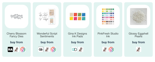
Note: all supplies are linked to multiple sources in the thumbnails below.
The bottom three colors of my chosen palette range from a deep turquoise to a dark blue, so that’s what I went with for my background. I started with an aqua card base, and then I blended inks onto the front of the card base to create a nice blend. When I’m going for deep colors like this, I find that it saves time to start with colored card stock. But, you can also start with white card stock. I used a mix of Pinkfresh Studio and Gina k. Designs inks for both the background and the cherry blossoms. For the background, I used Gina K Tranquil Teal and Blue Lagoon, and then I used Pinkfresh Studio Stargazer to achieve the darkest color at the top.
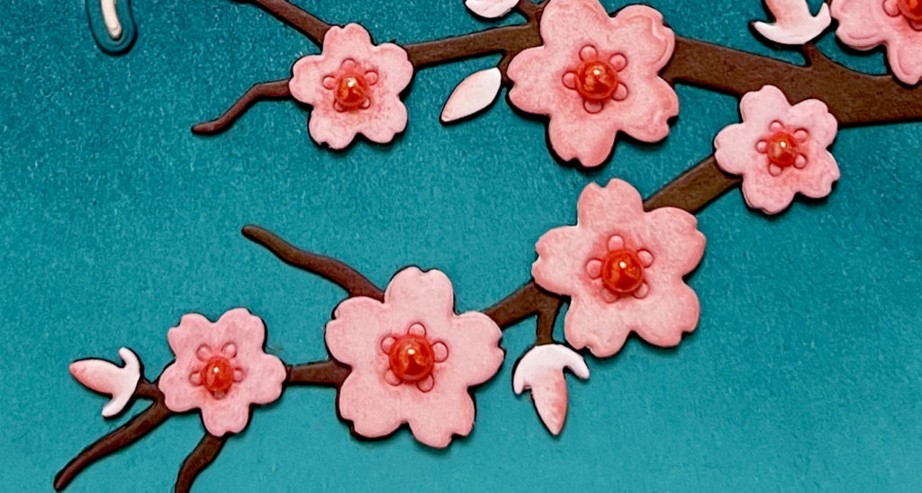
For the cherry blossoms, I first die cut the branches from white card stock. I then blended on some Gina K Dark Chocolate. I was trying to get that reddish brown color that was in the color palette, so I also pulled in some Gina K Cherry Red. Do you have to match the color palette exactly? Of course not. Why did I try so hard? No idea. Anyhoo…. For the flowers, I again cut everything from white card stock and then used Pinkfresh Studio Ballet Slipper to color them. I took a very small detail blending brush and added Pinkfresh Studio Passion Fruit to the middle of each flower. I also ended up adding a matching pearl embellishment to the center of each flower. I don’t have colored pearls in my stash, but I do have white pearls and alcohol inks. So, I just colored them with one of my red Copic markers! I finished the card with the “hello” from the Wonderful Script Sentiments set from Spellbinders.
Making the Second Card
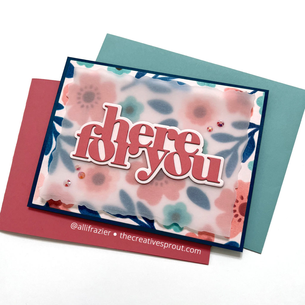
My next card features the same color scheme, but this time I used stencils instead of dies. Using stencils is a really easy way to incorporate the same ink colors that I used on the first card. For my background, I used the new Sweet Bee Stencil Pack from Concord & 9th. I first cut a panel of white card stock and then blended the Ballet Slipper ink from Pinkfresh Studio over it. I then pulled out the stencil pack. In addition to the colors that I used on my first card, I brought in Aged Mahogany Distress Oxide for the center of the pink flowers, and Altenew Lagoon Ink for the turquoise flowers.
Since this turned out to be a really bold background, I decided to tone it down with some vellum. I used the Deckled Frames Die from Waffle Flower to cut the vellum. Attaching vellum to a card is always a challenge because you don’t want adhesive showing through. On a card like this, with a large sentiment, it is easy peasy. I cut my sentiment from colored card stock and the shadow layer from white card stock. I blended the Ballet Slipper ink on that shadow layer so that it matched the background of the stenciled panel. I cut two layers of both the word and shadow, adhered them together, and then adhered them to the vellum. On the back of the vellum, behind the word die, I added foam tape. I then adhered this to the card front. To finish this card, I added some pink jewels.
I ended up really loving this color scheme. And while I rarely make the same card twice, I do think that revisiting a design from the past and giving it a fresh look with new colors is something that I will do more of when my mojo is feeling low. I hope these cards put a smile on your face today. Leave me a comment and let me know where you find inspiration!
Wishing you all a crafty day,
Allison
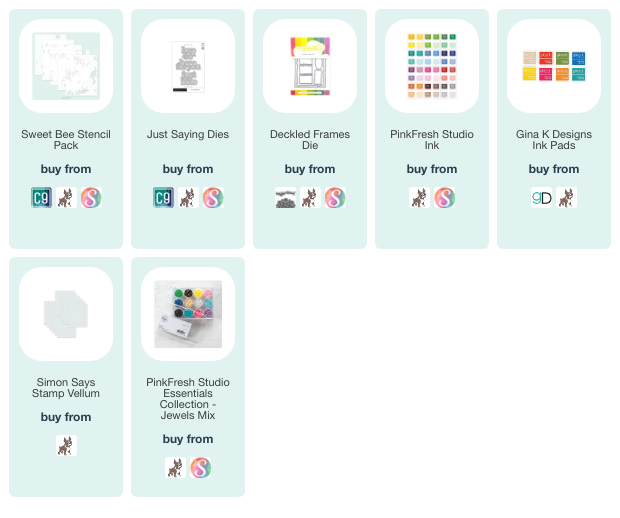
SUPPLY LIST – The Essentials
Note: External links on my blog may contain affiliate links. This gives me the opportunity to earn a small commission when you click on the links and place an order. This comes at no additional cost to you. Thank you so much for your support! You can see more information on my Affiliate Disclosure page.

Love these, esp the cherry blossoms. IDRemember if I ordered that from HA or not, but I love what you’ve done w/ it.
Great cards.
Lori S in PA
Thank you so much, Lori! Hope you had a great weekend.